responsive design: list overview
Clicking on a list on the hyperkitty’s landing page will lead to the list overview page. On this page you’ll see list details, such as recent discussions, popular discussions, and list statistics. The original design for the page looks like this:
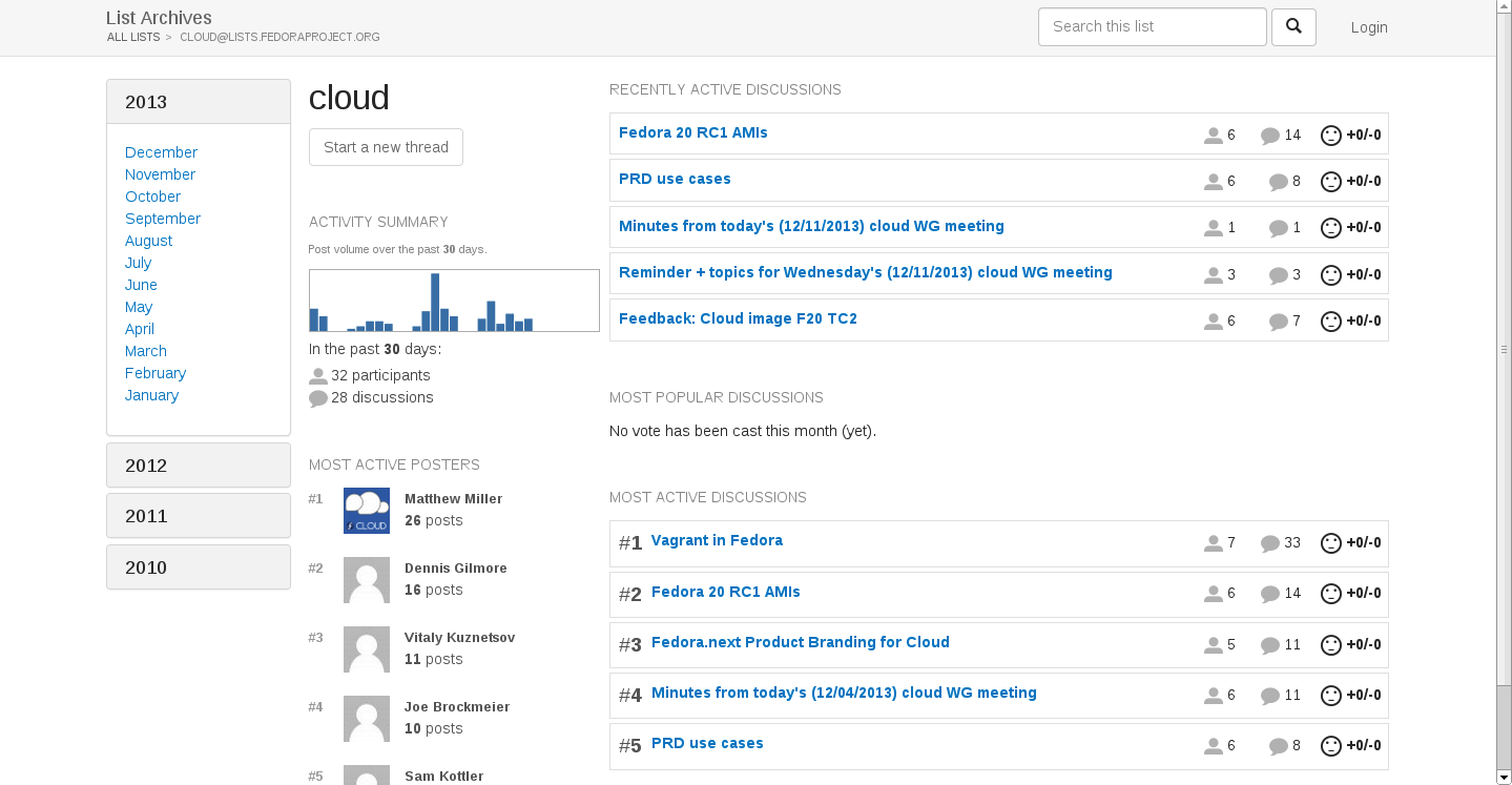
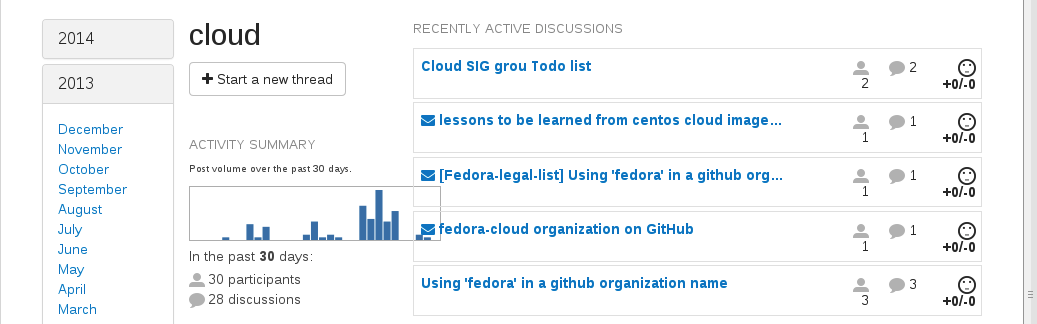
However, two features that aren’t captured in this design is the ability to reply to a recent discussion you’ve posted to, or bookmarking discussions so that you can easily refer back to them. Of course, it’s certainly possible for you to use the search box to find the appropriate threads, but that’s additional effort that shouldn’t be necessary for common tasks. You’ll also notice that common thread features aren’t shown in any of the discussion lists. For example, in the group for most recent discussion, all we see is the title of the thread which started the discussion, how many posts there are, and how many users have posted to that discussion. This is all useful information, but what other features like when was the most recent thread posted in the discussion?
With these three things in mind, I redesigned the list overview page to look like this:
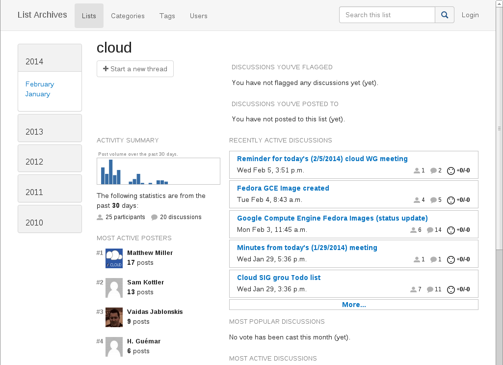
The overall look and feel of the page is still the same; I’ve mostly just shifted some pieces around. A couple of things to note:
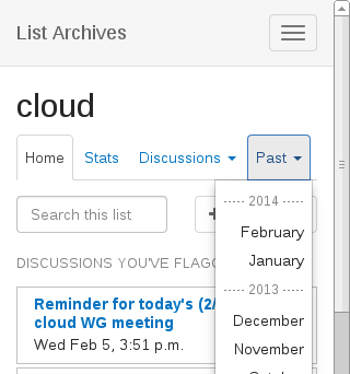
- Sidebar: On wide screens, having the list of months on the side is not a problem. But for smaller screens we need a much more compact version. Based on my previous decision to minimize the use of sidebar menus, I opted to squash the months into a drop down that shows up in a horizontal tab menu.
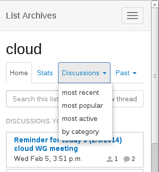
- Navigation menu: Speaking of the tab menu, I decided to use it as a collection of shortcuts. In other words, all of the content loads (vertically), and you use the nav links to jump to certain spots on the page. On smaller screens, it’s going to be hard to tell what exactly is on the entire page, especially if you’re a first-time visitor to the mobile site. The menu items on the nav bar provide simple cues letting you know that there’s a section for list stats, various discussions lists, and threads from a particular month (which technically redirects to you another page).
This nav bar goes away though after the screen reaches a certain width, at which point the page has enough real estate to lay everything out in a way that hopefully makes the content groupings implicit.
One minor change I had to make was to add some javascript to redraw the ajax charts every time the window is resized. Without this, you can get problems like this:
In this example, the window went from a larger viewport to a smaller viewport. Changing viewports may not happen all that much on desktops/laptops (where users often just leave their browsers set at the largest viewport), but on mobile devices, it is not uncommon to find users switching from portrait to landscape mode (or vice versa). By adding a couple of lines of javascript, we can catch these cases and redraw the chart <div> so that it scales well with our fluid layout.