responsive design: hidden complexities
Working on the hyperkitty frontend has been my first foray into responsive design. Previously, when designing for mobile devices, I’d focus on native applications or do mobile-only websites (e.g., upon detecting a mobile browser, you’d be redirected to a mobile version of the website). Both of these methods have the benefit of being able to design sites/apps that are tailored very specifically for mobile devices. However, the downside is that it’s yet another piece of software that has to be maintained. So that’s at least one good reason for moving towards responsive web design: all the front-end code is in one location, so there’s only one place to go to update things.
What’s been nice about the hyperkitty project is that much of the front-end redesigns have already been mocked up. But, the catch is that the mockups are all for large (desktop) resolutions. This normally wouldn’t be much of an issue, but hyperkitty’s front-end is based on Twitter’s Bootstrap and, starting in v3.0, Bootstrap’s is designed to be mobile-first. But what does that mean exactly? Having worked with Bootstrap for a few weeks now, I’ve come to better appreciate responsive design patterns and now know that it takes a different type of eye to consider things mobile-first.
Consider this layout (hyperkitty’s list overview page):
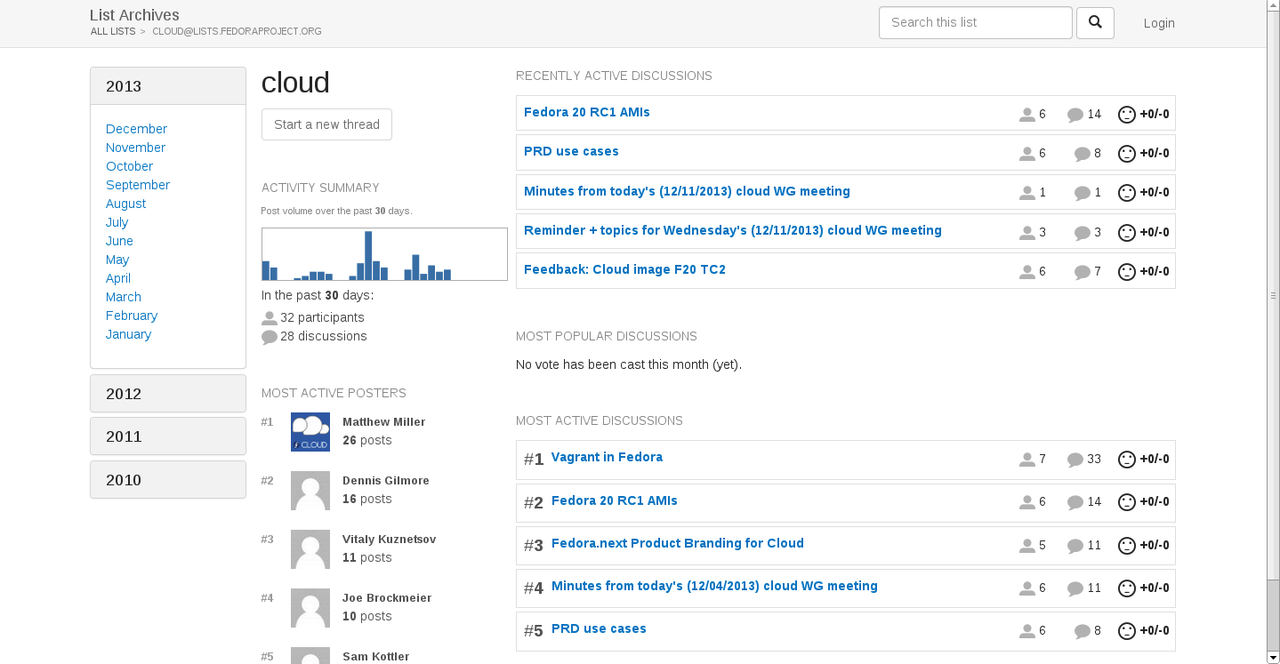
On the surface, we can see that this is a 3-column layout: the left-most column contains a list of the months, the center column contains various details about the list, and the right-most column contains various groups of discussions. Now, the simplest way to make this a responsive layout is to simply use Bootstrap grid so that for medium to large screens you could, for example, use something like col-md-2, col-md-3, col-md-7 to make the 3 columns. With this layout, Bootstrap will automatically reformat your layout on smaller screens by stacking the columns one on top of the other. Usually, Bootstrap will stack them in the order that they were declared. So if the HTML markup was written left-to-right, then the left-most column would be on top, followed by the middle column, and lastly the third column would be put on the bottom, at the end of the page.
While this layout certainly qualifies as being responsive, it’s clearly not ideal from a user’s perspective. Why? Well, looking at the design mockup, one would easily prioritize the left-most column as being the least important information-wise. The title of the list you’re looking like, the list of the threads in the right-most column, or even the list statistics in the middle column are all arguably more important that the list of months on the left-most side column. Accordingly, the layout on mobile devices should emphasize content areas that are more important and place them in more prominent areas.
Now, Bootstrap does make it easy to change the order of stacking by changing the order that columns are rendered (using col-XX-pull-N or col-XX-push-N). But what happens when there’s a subsection of a column who’s more important than a subsection of another column? Now it’s getting to be more complicated in how to (easily) do the responsive design. For example, what if one of the groups of the threads in the right-most column is important, but the rest isn’t. And the top-most section of the middle column is important, but the rest isn’t? To my knowledge, Bootstrap only allows changing the order of columns as a whole; there isn’t a way to pull out certain pieces of a column and render those before other pieces in another column.
Of course, the ‘cheap’ way could be to create two different layouts in your markup: one for smaller screens and another for larger screens, each wrapped in their own <div>. From there, you could use Bootstrap to hide the appropriate <div> section depending on the screen size. But this is clearly not optimal, if only for the reason that it doesn’t follow the DRY principle. After all, we’re trying to rely on responsive design patterns in order to less code maintenance burdens. Having repetitive chunks of code would certainly not help our case.
So, between following DRY principles and supporting intuitive interaction flows, designing mobile-first has been challenging. While I’ve found it is not too difficult to redo a webpage at large resolutions to be Bootstrap-compatible, it is a lot more challenging to make that same page responsive. Specifically, the hard part is that it more often than not requires a complete redesign of the page. One has to re-consider the layout of the page, starting from the smallest screen. What are the most important pieces of information? And how do we lay out those elements first? But you can’t just consider any one resolution in isolation. Once you pick a layout, you have to consider the Bootstrap implementation of responsiveness and see if it’ll scale well at larger resolutions. Sometimes what stacks well in smaller resolutions will leave too much whitespace at larger resolutions. Now, whitespace isn’t necessarily a bad thing, but it simply shows that there are a lot of things to consider when dealing with mobile web design.
This is a well done article thanks, i can now get on and implement a responsive feature into my website. It’s cool that the website can scale to the device.
Is the responsiveness limited to mobile platforms?
I orient my monitors portrait, not landscape, because what I do almost all the time is read text, and portrait is much, much better for that. This usually works great for the web because lots of web designers are still designing for 4×3 screens at 1024×768 or something absurd, so I get nice long flowing pages instead of the giganto-sidebars you often get on widescreens.
However, now some forward thinking web designers are attacking the ‘sidebar problem’ by trying to come up with layouts that look good on widescreens, I have trouble because they don’t look good on portrait displays.
Can the hyperkitty design cope with this?
Thanks!