responsive design: list of lists
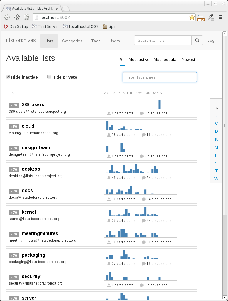
The landing page for hyperkitty is the list of lists page. As the name implies, this page shows a list of all the available mailman lists. Here’s the current front-end for the page:
In creating a responsive design for this page, I considered what kind of layout the page should have for smaller screens and decided that there were a few design changes I wanted to make:
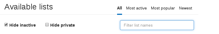
- Sidebar: On wide screens, having a menus on the sides are a good utilization of what would probably just end up being whitespace. However, on smaller screens, every pixel counts and having any sort of side menu takes up valuable real estate. Instead I decided to go for an inline drop-down menu. I visually separated this menu from the other switches (‘hide inactive’, ‘hide private’, and the filter box) because those functioned as ajax updates to the table (i.e., updates the table without a refresh), while the sidebar menu options reload the page.

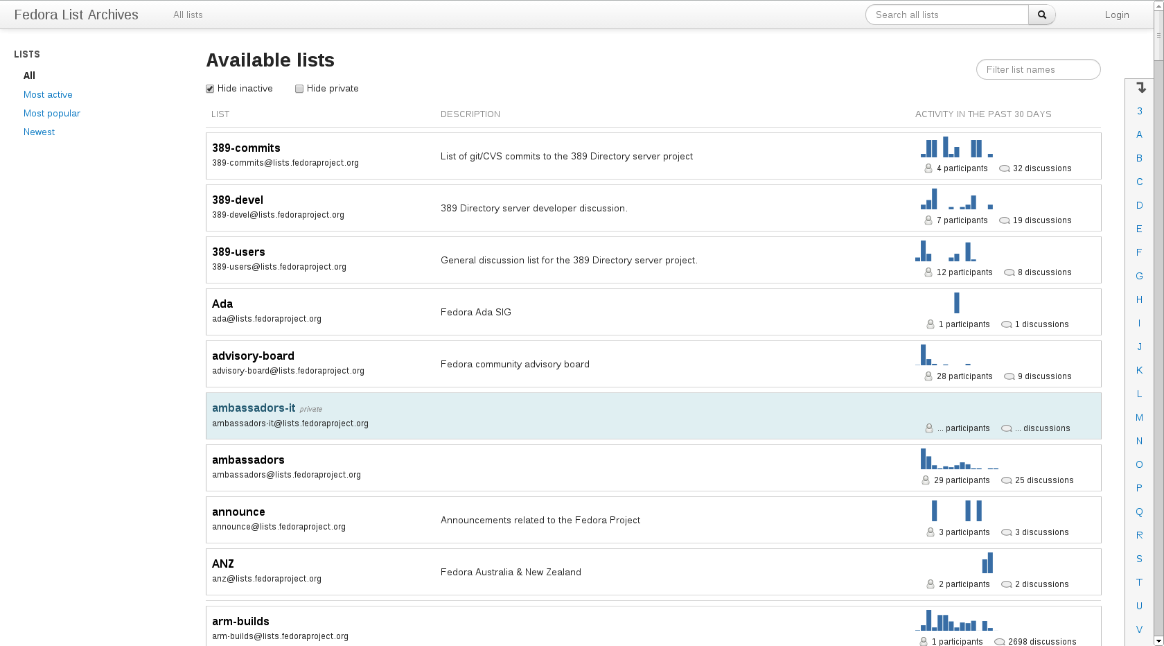
But even still, having a menu in the sidebar (for wider screens) isn’t necessarily the best use of whitespace. It’s useful, for example, on sites that need more complicated search features (e.g., shopping sites), but in our case, there seems to only be a few switches that we need. So, to keep the layout somewhat consistent between different viewports, I opted for a header that looks like this for wider screens:
Unless folks are super attached to having a side bar menu, I’ll try to see if I can omit the sidebar on other pages as well (such as the category and user profile pages). Instead I’ll try to work in the menu options in other ways on the page so that the main content can take up more space.
In order to keep a somewhat consistent look throughout the pages, I’ll try to see if I can omit the sidebar on other pages as well. Unless - Lookup bar: For relatively little screen real estate, the lookup bar is certainly useful when there are a lot of mailing lists to sort through. However, at smaller screens, this is an element that there just isn’t space for. I thought about adding yet another dropdown box, perhaps by shrinking the width of the filter box and adding the dropdown box next to that. However, I opted to not include it since scrolling on mobile devices is relatively easy (just a simple flick up or down). However, if folks are really tied to the feature, I can easily add it back in for the smaller screens.
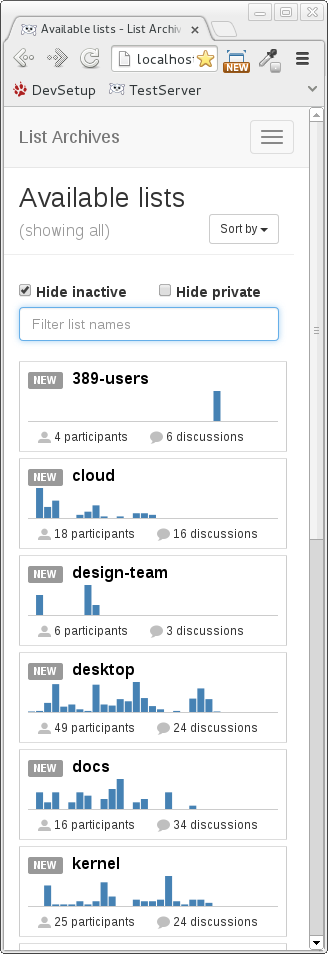
- Table columns: Bootstrap provides a
table-responsiveclass, but this simply adds horizontal scrolling to tables, which I don’t find to be particularly user-friendly on small screens. Instead I opted to go with a 1 column table, omit the table header, and to vertically stack the list details within each row. In my test setup, none of the mailing lists have descriptions. If they did, they would appear below the list title and above the list’s graph. I found the mailing list’s name and the address to be slightly redundant, so I’ve opted not to show the address (e.g., 389-devel@lists.fedoraproject.org) is not shown) for smaller screens. This leads to fatter rows (since so much information is included in each row), but that also means that they are more easily selected on a touch-screen, so hopefully this is an acceptable design trade-off.
Pulling everything together, here are screenshots of the page for the list of lists page
at a width of 320px:
at a width of 480px:

at a width of 1024px (and larger):